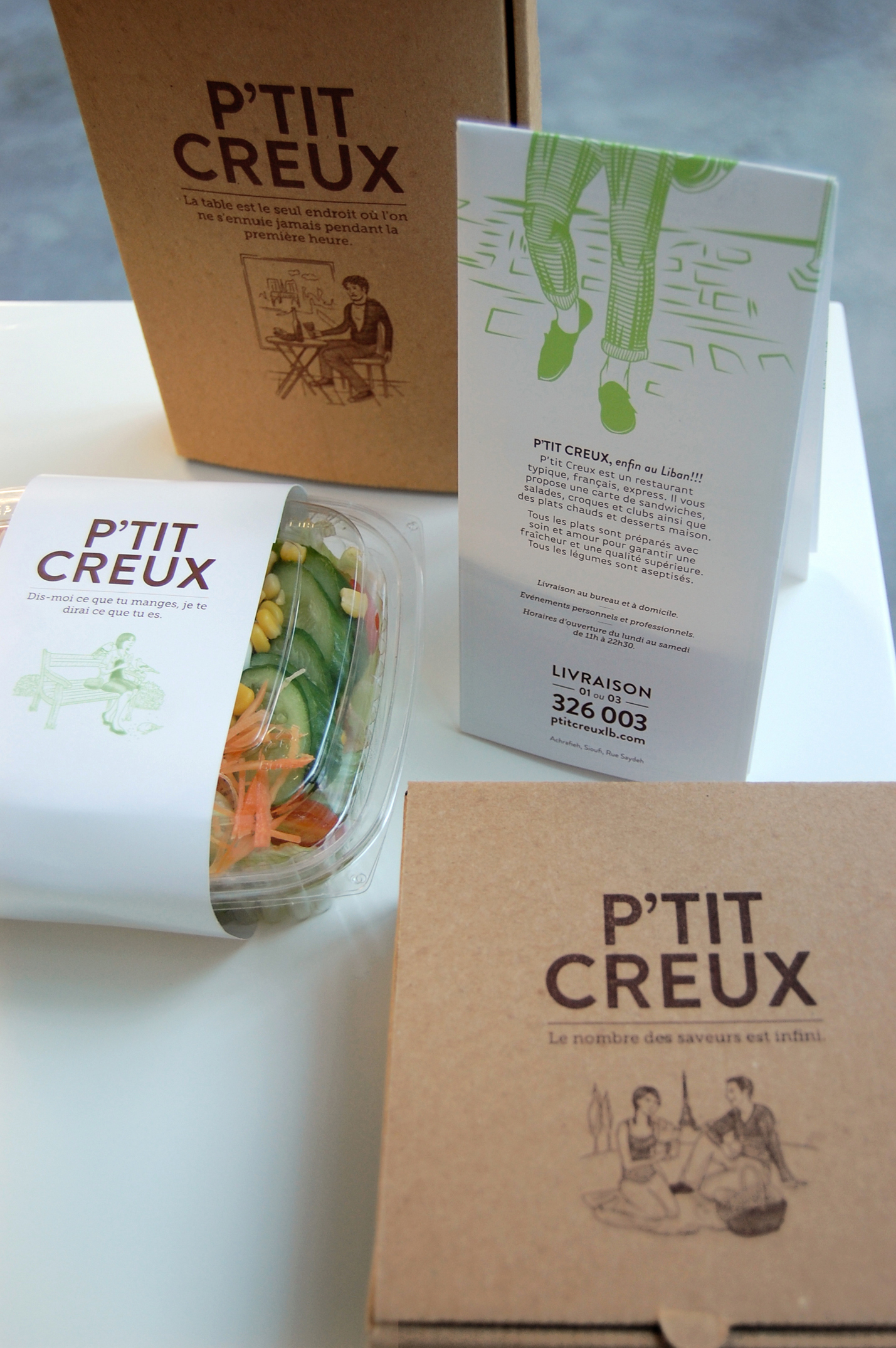
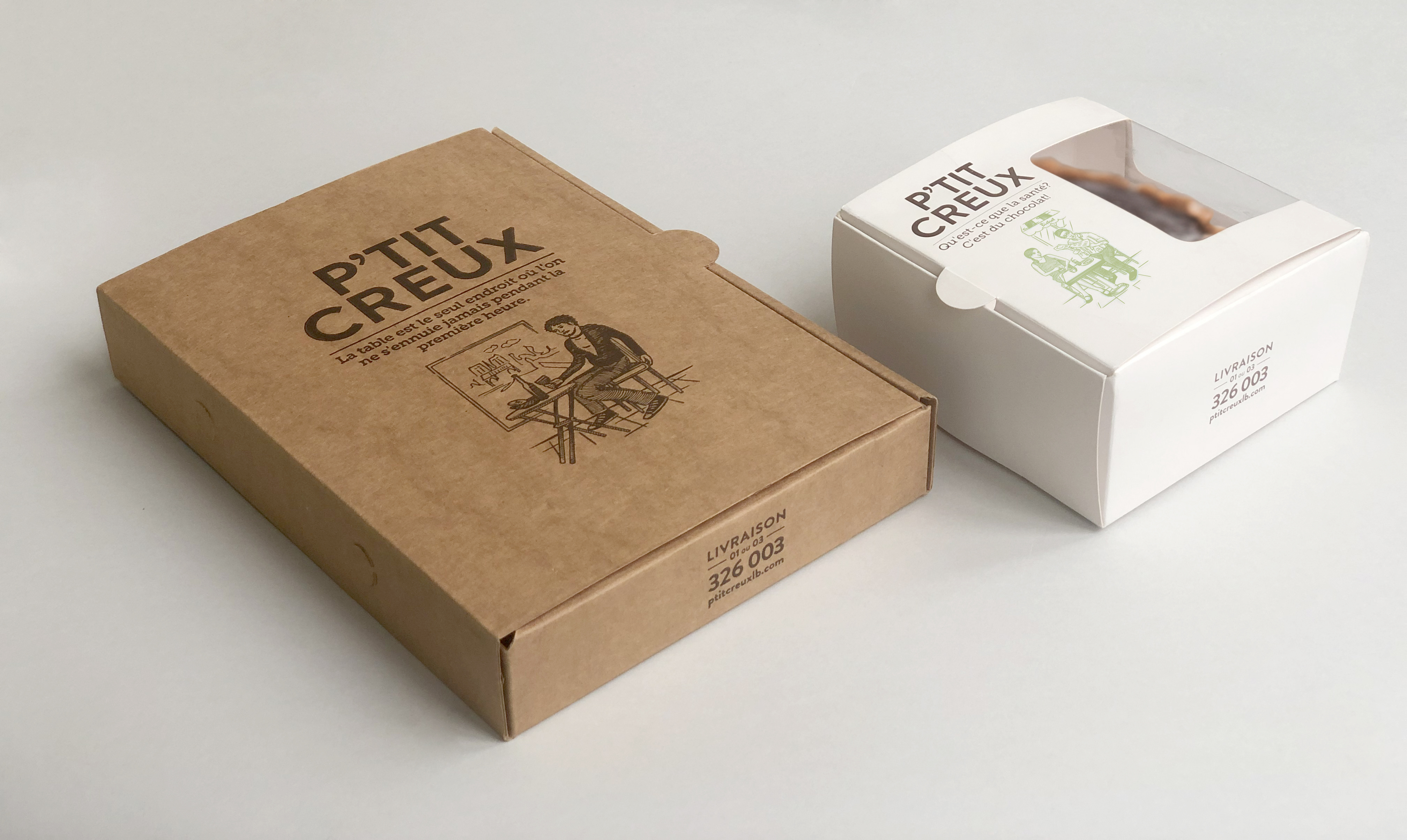
P’tit Creux is a small resto-café in Beirut that serves and delivers French food.
After conducting a market research, we came up with the name and a positioning of P’tit Creux as a provider of fast, healthy French food.
Inspired by 19th century “French” typography, the identity elements of P’tit Creux are based on combinations of multiple typefaces and dynamic relationships and hierarchies between typography and graphic elements.
Type foundries in the 19th century also produced woodcut illustrations, that inspired us to create a set of illustrations in an etching style that depict young people in typical Parisian settings. We completed the identity with quotations from Brillat-Savarin’s Physiologie du Goût, reflecting on the art and science of cooking as well as the pleasures of the dining table. The overall identity is friendly, appetizing, and engaging.


