Saltek is a leading manufacturer of bakery equipments in the Middle East with a heritage built on over 33 years of manufacturing large industrial machines that produce pita bread, European bread, and pastry.


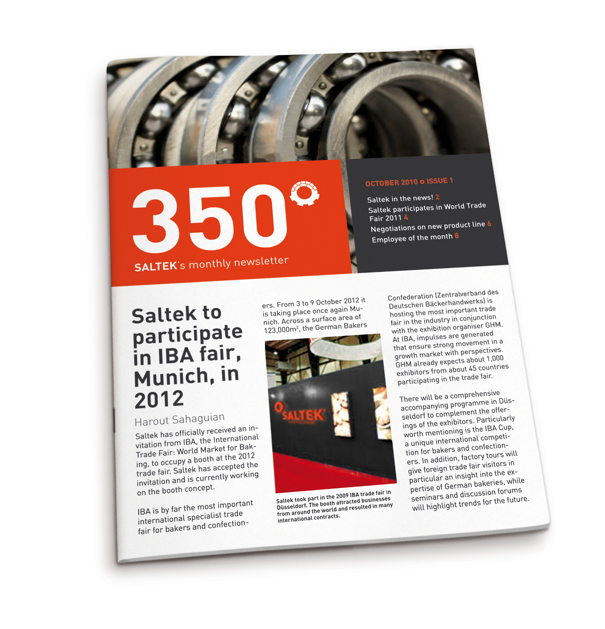
We worked with Saltek to define a major visual identity uplift that retained its motto: "We have modernized traditional bread making means." In its old logo, oven bricks represented tradition while a cog inside the oven stood for technology and modernization. We maintained this idea in our approach, and rearranged the elements to come up with a catchy symbol and dynamic logo composition. By introducing new colors -red-orange to represent the warmth of the baking environment and dark gray to assert the mechanization of the baking process- we created a powerful color contrast that translates the brand essence. Reflecting the duality in the logo is the image style. Close in on details of diverse bread stacks and industrial parts are paired to convey their integrated relation in the manufacturing process offered by the equipment lines of Saltek.